This is an alternative space from my website. I plan to share behind the scene images of a working sign shop, detailed stages of production, techniques & processes, how things work, or how I've made them work for me anyway. I design and build signs, it's commercial art, each is an art project. I strive to keep them unique and different. This keeps it interesting and challenging for me and gives the client a unique project. Hopefully you find this interesting and perhaps educational. There may be wonderful mishaps, paint spills, or some whacked effects gone awry. Stuff happens, art happens, I occasionally step back and just smile (and grab a camera). Often the garbage generated is art in itself. I have archives of photos and will randomly choose some to share. They may, or may not be current work. Enjoy. - Brad
Monday, October 31, 2011
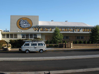
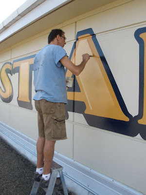
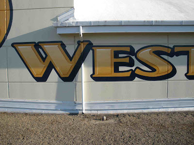
West Albany Bulldogs
The front of the school and my relinquished work truck. It's amazing how often this old bus functioned better for my work needs than a pick-up. Now I drive a pick-up.
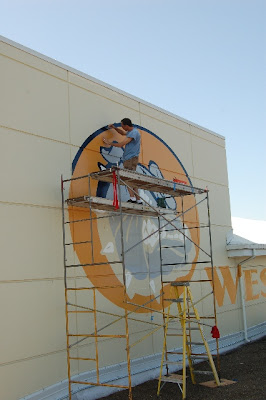
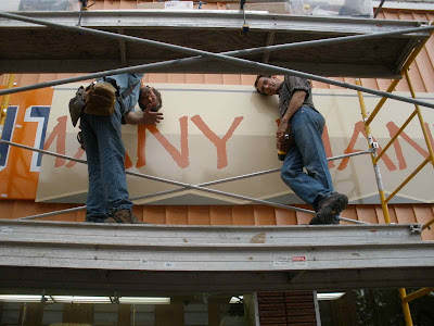
I brought my friend, Pete McKearnan, down from Portland to help with this one. Pete has a business called Signworks. He's one of P-town's finest and does top notch work. He brought his scaffold, which is narrower than most, so it breaks down and travels in his small truck.
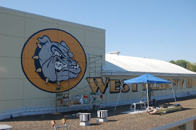
We projected the artwork late at night, after in got dark. The opaque projector sits on a board, clamped to the top of a ladder, right at the front corner of the roof, as far back as we could get it. It took about 6 projection locations to get all this. We were working away well after midnight when an Albany cop paid us a visit. Assuming we were up to mischief, he silently climbed up our ladder to the roof we were on, stumbled over the last few rungs and woke up the neighborhood as he stormed us by surprise. It sounded like he about knocked the ladder over. He was a bit embarrassed.
Pete's quite the brush slinger.
It was late summer and the temperature was over 100. Working on the north facing concrete wall wasn't too bad. The wall had a coolness about it.
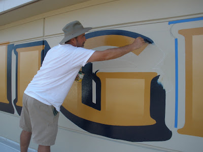
Pete's brush doesn't run out of paint. He maintains total control, even fully extended. He's good.
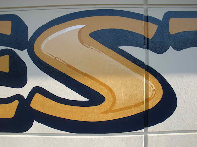
I'm adding bevels to make the centers look embossed.
The centers have a blended gradient; lighter at the top and darker at the bottom. We had to guess how much paint to mix. We didn't want much of this intermixed paint left over, yet we had to have enough to finish. We brush blended 4 or 5 shades together.
These dry brush 'reflections' where the convexed outline changes color were fun to do.
Posers.
I emailed Chuck Davis at letterheadfonts.com a photo of this, without appropriately submitting it to the gallery at his website. This gallery of international work is typically outstanding. It somehow ended up in the gallery. Then it somehow was a finalist in his annual design contest. It did not place for a prize. Fitting, it's not quite in the same league, or level of design complexity as the winners. It's still there, near the bottom right of this page. Ironically, the font is named LHF Bulldog.
Sunday, October 30, 2011
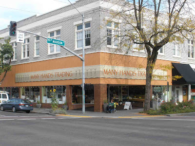
Many Hands Trading
These are my 2x4 stackers. A pair of them will bridge a wet 4x8 panel and you can keep stacking them vertically, drying lots of wet paint at once.
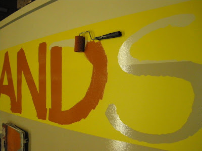
Paint rollers cut to efficient size. I'm coating 3 parts and unmasking the tape on each panel before I move to the next.
All the years I've been using '1 Shot Lettering Enamel', it's always had lead in it 'for commercial use only' and been a wonderful product. I would thin it with various reducers. They've recently taken the lead out and it's not the same. I've had issues with premature oxidation. I called 1 Shot and talked with their chemical engineer. They now have a line of their own reducers and a hardener, much like an automotive paint system. I was reassured to stay with this new system and the paint would not oxidize prematurely. This sign is so large, will face south and west and get baked with UV. I needed to get it exactly right and have it last a good long time. There's lots of product in the above photo.
The yellow paint mask has a low tack adhesive for easy removal.
This is a historic building with a somewhat historic sign. It is not a historic storefront. A sign permit is needed and by leaving the old sign up, Margaret was able to grandfather in an exorbitant amount of square feet for new sign use. She needed to move fast, get open, and get money coming back in. This is retail. Because of the historical structure, she also had to also get approval from the Historic Resources Commission. Catch 22: the HRC moves a bit slower and it can take a couple months to get an answer. Frustration for Margaret. A permit is contingent on approval from the HRC. After many meetings, design mock-ups with construction details and such, she got her approval. Yay. We had to leave the old sign exactly in place and could not damage it in any way.
The Rexal Drug/Albright & Raw sign is porcelain enamel on steel. Each square panel measures 46" x 46" with 1" bent over sides. Adds up to 48"; stock material. Brilliant. Attaching the panels to the building are 3, 1" x 1" L shaped brackets per side, hidden under the sides. We attached similar brackets in a reversed configuration to the outside and our new 4' x 8' panels fit perfectly, overlapping the old panels by an inch. We removed a bucket of old rusty screws, then custom marked and drilled each new bracket to align with the old randomly placed hole. One by one, pain in the butt. New stainless screws attached the new brackets through the existing sign holes to the old brackets. There were a lot of these!! We used pop rivets to attach the new panels to the new aluminum L brackets. The new sign bridges over the old. We never drilled a new hole in the old porcelain enamel sign.
Saturday, October 29, 2011
welcome to the Oregon Country Fair
Here's a shot to lure you in. To see the rest and get the story, you'll have to take this link to my wife's blog. She's already posted more of the story. Do it, but please come back.
Friday, October 28, 2011
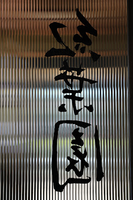
momiji-en, gold leafed windows, inside door
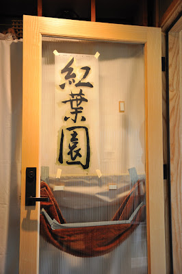
Aligning & taping the positive to the front of the glass.
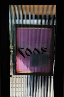
On the backside of the glass, 3 wood blocks for screen stops hold the image area of the screen directly in line with the positive.
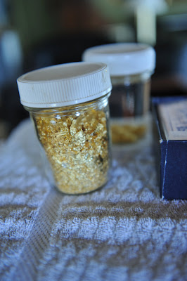
My collection of skewings.
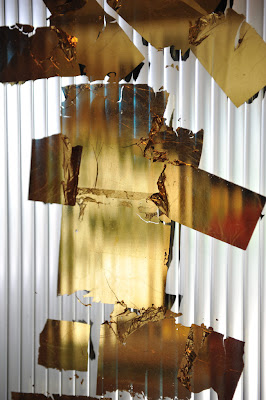
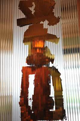
A golden mirror making me look good. Unprotected, the gold scratches easily.
The gold overlaps the image area; otherwise black ink will show throw from the front after printing. The bath towel catches extra size that ran down the glass.
Double checking from the work side. Looking through the image area of the screen to see that there's plenty of gold coverage.
The tape around the inside perimeter of the screen makes for easy cleanup.
The flood coat.
Pushing down on the double stick tape.
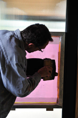
Vertical screen printing.
And the second pass. I'm printing 'off contact', so the screen is about 1/16" or 3/32" from the glass. I have spacers taped under the screen frame.
Slip...splat... Nope, not happening!?
Only a portion of the gold is saved. Most gets scrubbed off and is pretty much non-reclaimable.
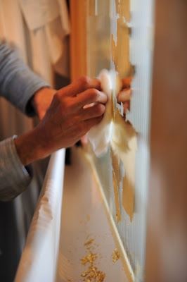
I'm using a slow drying gloss enamel ink so I've come back the following day to gently scrub off the extra gold.
I really like this glass.
Thursday, October 27, 2011
Momiji-en, gold leafed windows, outside door
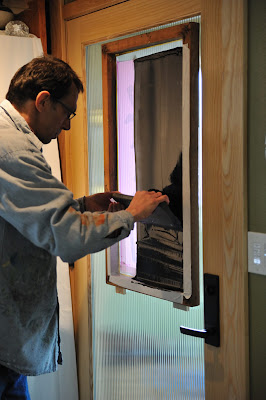
The positive is used to expose the screen. It blocks UV light to the red water based emulsion. The emulsion is first evenly coated onto both sides of the screen and allowed to dry in the dark. When exposed to UV light, it hardens. Both the protected image area and non image area will wash out with water, but the protected area washes out first. The screen is then blotted with newsprint paper and allowed to dry. Here I'm double checking to make sure the screen frame does not crash into the sides of the door. It's close.
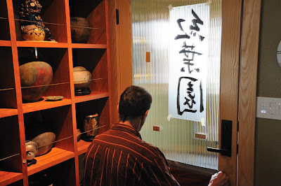
My gear & I in this small entry mudroom.
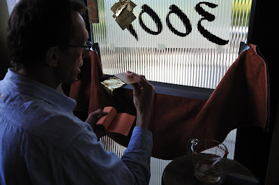
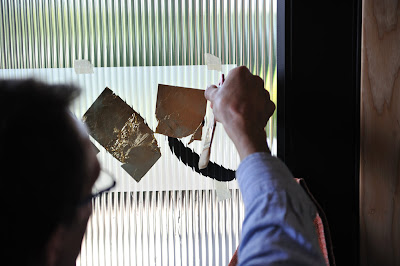
Laying gold leaf on the smooth backside of the glass door. The front side is quite textured.
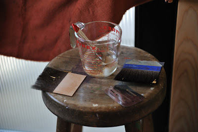
My shop stool makes a nice small work table. There are 2 gilders tips, they have long hairs for carrying the gold from the book to the glass. I use the draftsman's erasure shield to score the gold when I need less than a full leaf. The Pyrex cup has a water size for glass gilding. The recipe is 1 gelatin pill capsule to a pint of warm water. The size brush is never contaminated with anything else.
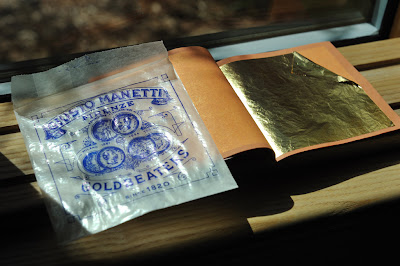
A book of Italian 23K gold. The 25 leaves are loose between thin paper pages. Pretty cool packaging.
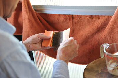
Tearing a leaf in half.
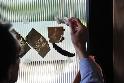
The window is wet with size cascading down. The gold sort of jumps off the tip and onto the wet film of size.
It does not always jump off and lay perfectly flat. here I'm running more size behind the gold to get it to float. Often it will unfold.
Pinning down the corner so the leaf does not run downhill with the size. Once most of the size drains out, the gold stays put.
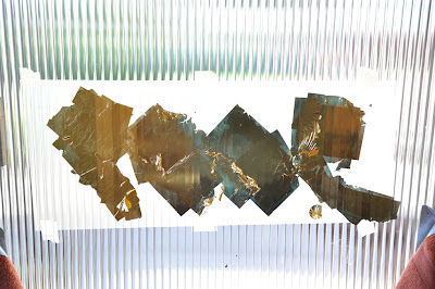
Wherever the gold has a fold or wrinkle, or where a leaf butts up to the next, there will be hairline gaps and pinholes. A quality burnished glass job always requires a second gilding. Here the second gild is applied, but not yet burnished.
I'm applying double stick tape to hold the screen to the glass.
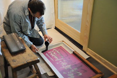
Black enamel screen printing ink has been transferred to a bean can and reduced with thinner.
Wood blocks held to the glass with double stick tape work as stops to align the screen. The screen was pre-aligned and the blocks pre-stuck before I got into the ink.
The screen has been flood coated and I make 2 passes with the squeegee.
In total control... I know where all the wet ink is. Just a small bull in a china shop.
Quite cavalier, I reclaim all the unused ink. Note the small piece of newsprint paper for a drop cloth. Silly me. So green, I won't waste any extra.

